
Home » Creative Blog » Blog » The Power of Color
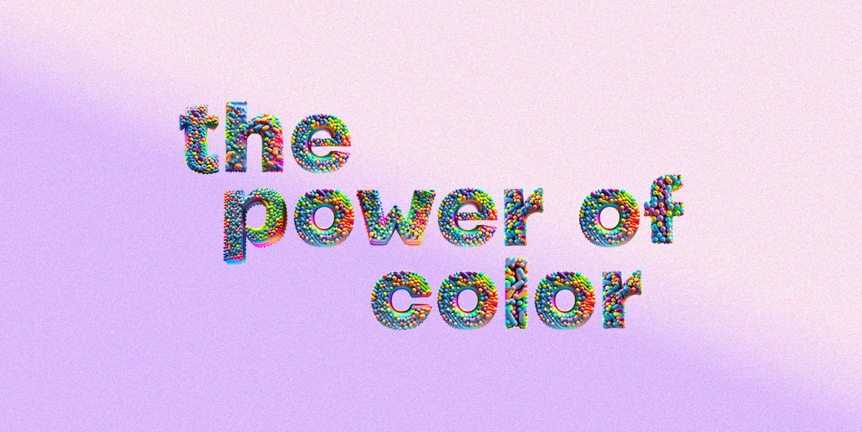
The Power of Color: Unveiling the Influence in Identity Design
In the vast world of design, color is more than just a visual element; it is a powerful tool that shapes our emotions, perceptions, and even influences our decision-making processes. Whether in brand identity or product design, the colors we choose play a significant role in creating a lasting impact on the audience. In this brief exploration, we’ll unravel the fascinating influence of color in the broad spectrum of identity design.
The Emotional Palette
Colors have the remarkable ability to evoke emotions and moods. From the calming embrace of blues and greens to the energetic burst of reds and yellows, every shade carries a unique emotional resonance. Consider how a brand’s color palette can shape the way consumers perceive it – a warm and vibrant palette might convey a sense of friendliness, while a sleek and minimalistic approach can evoke sophistication. The emotional palette goes beyond aesthetics; it becomes a language that communicates the essence of a brand or product.
Sensory Symphony
Color is not just a visual experience; it engages our senses on a profound level. The psychology of color suggests that certain hues can stimulate specific sensations and responses. Warm tones like reds and oranges can create a feeling of warmth and passion, while cooler tones like blues and greens may induce a sense of calm and tranquility. Identity design goes beyond what meets the eye; it orchestrates a sensory symphony that resonates with the audience’s feelings and perceptions.
The Subtle Art of Branding
In the competitive marketplace, where first impressions matter, the color of a brand becomes a silent ambassador. Think about iconic brands, and their colors instantly come to mind – Coca-Cola’s bold red, Starbucks’ earthy greens, or IBM’s calming blue. These color choices are not arbitrary; they are strategic decisions that have been carefully crafted to reinforce brand identity. The right color can distinguish a brand, making it memorable and instantly recognizable in a sea of choices.
Studies have shown that up to 90% of snap judgments about products can be based on color alone.
Influence on Purchasing Behavior
Color wields a considerable influence on our purchasing decisions, often at a subconscious level. Studies have shown that up to 90% of snap judgments about products can be based on color alone. The color of a product’s packaging or the hues used in an online store can sway consumer perceptions and trigger emotional responses. Understanding the psychology of color in the context of consumer behavior is a potent tool for businesses seeking to connect with their target audience.
Color in retail
In the ever-evolving realm of retail, the strategic use of color stands out as a paramount element in shaping the customer experience and driving consumer behavior. Retail design, a multifaceted discipline, leverages color as a powerful tool to elicit specific emotions, guide customer navigation, and reinforce brand identity within physical spaces. The careful selection of color schemes goes beyond mere aesthetics; it serves as a silent communicator, influencing the mood and ambiance of the retail environment. The thoughtful incorporation of color into a store’s design can create a distinct atmosphere, fostering a connection with the target audience and enhancing the overall shopping experience. Colors not only adorn the shelves but also play a pivotal role in crafting a narrative that resonates with customers, inviting them on a visual and emotional journey. In the face of online competition, a well-executed color strategy transforms a retail space into a vibrant destination, where each hue contributes to an immersive and memorable experience, turning the act of shopping into a sensory adventure.
CMF design
Color, Material, and Finish (CMF) design is a holistic approach that goes beyond the realm of traditional design by integrating color, material, and finish into a seamless, cohesive narrative. In the context of product design, CMF is a crucial aspect that enhances the tactile and visual experience, elevating the overall perception of a product. The choice of materials and their textures, combined with the right color palette and finishes, can convey a brand’s identity, values, and even the product’s intended use. CMF design plays a pivotal role in creating a harmonious connection between the product and the user, offering a multisensory encounter that transcends mere functionality. Whether it’s the soft touch of a matte finish, the warmth of wood textures, or the bold statement of metallic accents, CMF design transforms products into tangible expressions of style and purpose, making them not just visually appealing but deeply resonant with the user’s emotions and preferences.